Friday 30 March 2012

DSDN171: Blog 2 Research Statement and Annotated Bibliography

Book (Single Author)
Irwin, D. (1997). Neoclassicism. London : Phaidon Press
Contains neoclassical design and art exhibitions.

Journal
Alm, G. (1994). Neoclassical furniture design in Sweden
.The Magazine Antiques. 145.4,562-571.Retrieved from http://search.proquest.com.helicon.vuw.ac.nz/docview/211178012
To view examples of Neoclassical design movement in Swedish.

Edited Book
Clifton-Mogg, C.(Eds) (1991). The neoclassical sourcebook. London : Cassel
Information concerning neoclassical architecture, art, design, decoration, and ornament.

Website
Melanie. ( May 10, 2011). Veranda – Neoclassical Design for the 21st Century, Retrieved from http://www.classicaladdiction.com/2011/05/veranda-neoclassical-design-for-the-21st-century/
To view some applications of Neoclassicism in today's society.

Picture 
Figure 1. Ingres, J,A,D. (c. 1827). Apotheosis of Homer [Painting]. From Baudelaire and the Impressionist Revolution, Neoclassicism. Retrieved from http://impressionist1877.tripod.com/neoclassicism.htm
To view the sorts of architecture, clothing, paintings, that were common during the Neoclassical period.

Thursday 29 March 2012

DSDN101 Project 1 Hand In Individual

I Used the cover for the Smashing Pumpkins album Zeitgeist as precedence for my individual work. The object I used is a finger puppet of an Orangutan, this would be transformed into the central figure, the ape, in my drawing.
 My drawing has a foreground of water similar to that of the album cover, it has a central figure, it has a background of buildings roughly based on Wellington buildings, and a sky made of clouds and a sun. Compositionally the two pieces are similar. They are also similar in colour.
I used only the colours black, red, and the white of the paper as the album cover also uses these colours; this is a very minimal amount of colour used, but the fine lines appear to show different colour tones.
The drawing is a two dimensional drawing however the scale of objects as well as shadow gives it depth.

DSDN101 Project 1 Precedence Individual

Smashing Pumpkins - Zeitgeist

Ape Finger Puppets

DSDN101 Project 1 Hand In Touch And Draw


DSDN101 Project 1 Hand In Section


DSDN101 Project 1 Hand In Draw,


DSDN101 Project 1 Hand In Hatch,


DSDN101 Project 1 Hand In Identity,


Monday 19 March 2012

Jayden, Ken, Waterfall

My name is Jayden and I want to be a designer. All throughout my life I have consistently liked drawing; this didn't necessarily mean that I was good at it but I stuck with it and I like to think that my ability has improved.

My hobbies include: Hockey, Scouting, Tramping, Music, Guitar, Staying fit, and creating things. My hobbies are likely to become  inspiration for my work. I call 'creating things' a hobby because I use the random bits and pieces that I collect and transform them into pieces of wacky art and gifts. Doing this has allowed me to appreciate the bits and pieces that I collect as materials rather than trash.

Throughout College my favourite subject was graphics. To me graphics was a chance to capture my creative ideas and funnel them into a specific design brief. I enjoyed this type of work at College, I was able to get away from the strictly academic subjects and express myself through design. The next step towards furthering my skills in design was obviously University.

At Victoria University I am majoring in design and minoring in film and media studies. My ultimate goal is a career within the film industry, aspiring to be like Sir Peter Jackson, whether this is in the area of film directing, prop design, set design, or elsewhere, I am yet to decide but I would love having a career where I make a visible contribution.

My future currently appears positive. I am enthusiastic about my first year at University and am looking forward to producing an impressive portfolio of work over the course of the year.

Monday 12 March 2012

Hello there to all of my blog readers. This is my first second blog entry and it feels pretty good to be writing this; it means I have conquered the internet and began to use it as one of my tools as I, Jayden Robert Hamilton, slowly but surely take over the world.

Here is a link to what will no doubt be an inspiration to me throughout my years at University. 
A great band:Alice In Chains

Friday 9 March 2012

My first blog post for DSDN 101. And I'm writing it in... Yep, you guessed it, Helvetica.
A very interesting documentary; we were told of so many people's oppinions on the font, some absolutely adored it, as it was their idea of 'The Perfect Font' the proportions are just right. One person says it is the over used Shit that you see everywhere, it's like McDonalds; these people are the anti-modernists, The people who would use any font as long as it wasn't Helvetica, this created to some a rise in expression, to others a complete wreck of all work they had done to try to put some order into the world.
I see a need to have order in a formal situations where information needs to be conveyed seriously e.g. emergency information, street signs. This to me is where Helvetica is best used.
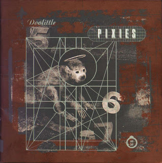
Other fonts are expressive and should be used everywhere, especially pop culture eg CD covers, posters, anywhere that fits. My favourite image shown in the film about the 'Grunge Typography' was this:

Pixies-Doolittle

The album cover of one of my favourite bands:Doolittle by Pixies. It shows many fonts used in different ways. The numbers are a reference to lyrics of songs on the album, they stand out and in doing so remind us of the song itself, or prepares us for the music we are about to listen to. (5,6,7 referring to Monkey Gone To Heaven, 13 referring to Number Thirteen Baby.)


Soundbite
My favouite quote from the movie is : "Good design is something we don't notice usually, but would miss very much if it wasn't there."

Whilst watching the movie I also thought about today's filthy fonts which are created by tagging. I despise taggers and their disgusting writing that I cannot read, I just thought that as I can read many fonts comfortably and still despise tagging is that what some people think of Helvetica? they can read it comfortably, but are the other fonts they see just crap and unreadable?