A very interesting documentary; we were told of so many people's oppinions on the font, some absolutely adored it, as it was their idea of 'The Perfect Font' the proportions are just right. One person says it is the over used Shit that you see everywhere, it's like McDonalds; these people are the anti-modernists, The people who would use any font as long as it wasn't Helvetica, this created to some a rise in expression, to others a complete wreck of all work they had done to try to put some order into the world.
I see a need to have order in a formal situations where information needs to be conveyed seriously e.g. emergency information, street signs. This to me is where Helvetica is best used.
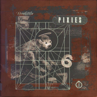
Other fonts are expressive and should be used everywhere, especially pop culture eg CD covers, posters, anywhere that fits. My favourite image shown in the film about the 'Grunge Typography' was this:
 |
| Pixies-Doolittle |
The album cover of one of my favourite bands:Doolittle by Pixies. It shows many fonts used in different ways. The numbers are a reference to lyrics of songs on the album, they stand out and in doing so remind us of the song itself, or prepares us for the music we are about to listen to. (5,6,7 referring to Monkey Gone To Heaven, 13 referring to Number Thirteen Baby.)
Soundbite
My favouite quote from the movie is : "Good design is something we don't notice usually, but would miss very much if it wasn't there."
Whilst watching the movie I also thought about today's filthy fonts which are created by tagging. I despise taggers and their disgusting writing that I cannot read, I just thought that as I can read many fonts comfortably and still despise tagging is that what some people think of Helvetica? they can read it comfortably, but are the other fonts they see just crap and unreadable?
No comments:
Post a Comment